Introduction
Insper’s brand guide covers print, not charts. It specifies Pantone
references, tints and shades per hue family, and rules for text on
colored backgrounds, but no categorical sequence and no guidance on
which palette suits which kind of data. This vignette records how
insperplot fills those gaps, which of its palettes are
brand tokens verbatim, and which are derived.
Accessibility
The main palette is the brand’s own hue set, and it puts
red, green, orange and yellow next to one another. That combination is
hard to read under the common forms of color vision deficiency.
Deuteranopia and protanopia both compress the red-green axis, so
categories that look distinct to you may merge for roughly 1 in 12 male
readers.
insper_palette("main")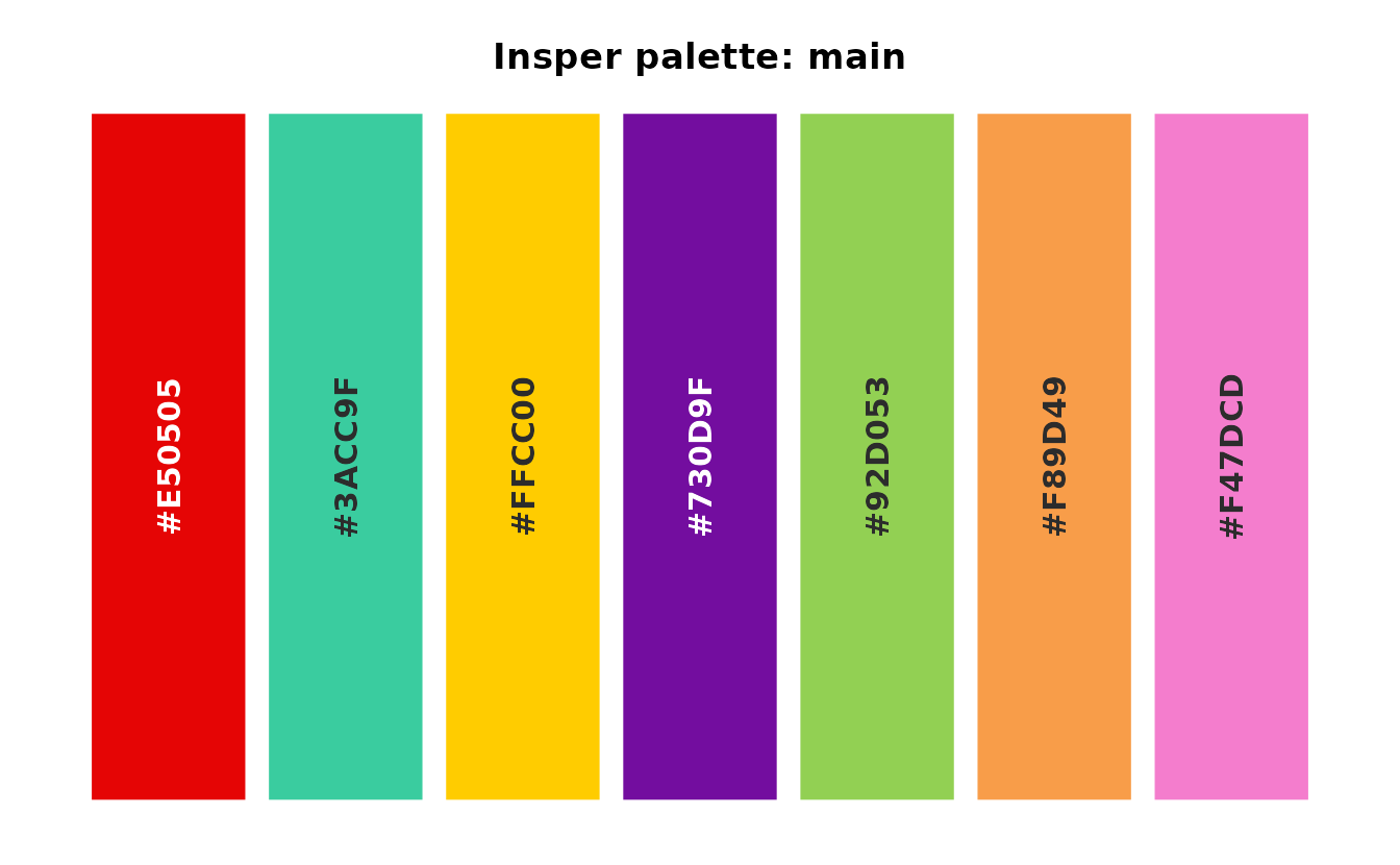
Use the colorblind palette when telling categories apart
matters more than brand fidelity: a chart with many categories, a slide
seen from the back of a room, or a document whose rendering you cannot
control. It is the Okabe-Ito set, designed so
that its colors stay distinct under the usual color vision
deficiencies.
insper_palette("colorblind")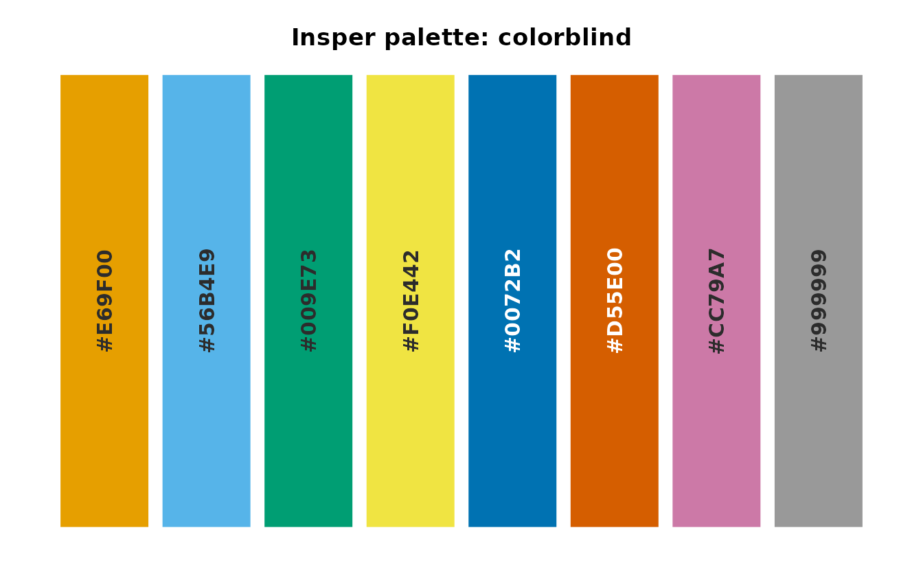
It is the only palette in insperplot with no Insper
colors. Use main for on-brand work, and switch to
colorblind when you have a reason to.
A separate question is what color text should sit on top of
a brand color. The brand guide rules on this for the family base colors
and neutrals, and the acessibilidade column of the
insper_color_reference dataset records those rules.
subset(
  insper_color_reference,
  !is.na(acessibilidade),
  select = c(nome, hex, acessibilidade)
)
#> # A tibble: 15 × 3
#>    nome        hex     acessibilidade
#>    <chr>       <chr>   <chr>
#>  1 vermelho    #E50505 branco
#>  2 branco      #FFFFFF preto
#>  3 preto       #000000 branco
#>  4 verde 0     #92D053 preto
#>  5 amarelo 0   #FFCC00 preto
#>  6 laranja 0   #F89D49 preto
#>  7 rosa 0      #F47DCD ambos
#>  8 roxo 0      #730D9F branco
#>  9 turquesa 0  #3ACC9F ambos
#> 10 cinza 0     #DCDCDC preto
#> 11 cinza 1     #ABABAB preto
#> 12 cinza 2     #808080 branco
#> 13 cinza 3     #5B5B5B branco
#> 14 cinza 4     #3F3F3F branco
#> 15 azul escuro #0E171D branco
The guide does not rule on the tints and shades, so those rows are
NA. For labels drawn on colored shapes,
insperplot computes WCAG relative luminance at draw time
instead. That is how insper_barplot() picks a white or dark
label for each segment of stacked and filled bars.
Typography
Brand guidelines
Insper’s brand guidelines assign three fonts.
- GT Ultra Fine Bold carries titles, subtitles and most highlights.
- Acumin Pro ExtraCondensed Bold carries other highlights, always in uppercase.
- Inter carries body text, with Verdana as a fallback.
Following them literally gives the code below.
theme_minimal(base_family = "Inter 18pt") +
  theme_sub_plot(
    title = element_text(family = "GT Ultra Fine Bold", size = 22),
    subtitle = element_text(family = "GT Ultra Fine Bold", size = 10),
    caption = element_text(family = "Inter 18pt")
  )

some_plot +
  annotate(
    "text",
    label = "SOME HIGHLIGHT ALWAYS IN CAPS",
    family = "Acumin Pro ExtraCondensed"
  )
This scheme is hard to reproduce. GT Ultra is a proprietary, paid font. Acumin Pro and Verdana ship with some operating systems but not others. Inter ships with few operating systems, but it is free to download from Google Fonts.
insperplot implementation
insperplot bundles Inter, so the font installs with the
package. Inter carries all text except the title, which uses Georgia, a
serif font that ships with most operating systems.
tinsper <- theme_insper()

tinsper$plot.title@family
#> "Georgia"

tinsper$plot.subtitle@family
#> "Inter"

tinsper$text@family
#> "Inter"
The default theme_insper() produces a plot like the one
below.
base_plot <- ggplot(mtcars, aes(mpg, wt)) +
  geom_point() +
  labs(
    title = "Basic Theme",
    subtitle = "USING THE PACKAGE TO MAKE PLOTS",
    x = "Miles per Gallon",
    y = "Weight (lbs)",
    caption = "Source: mtcars | Insper"
  )

base_plot +
  theme_insper()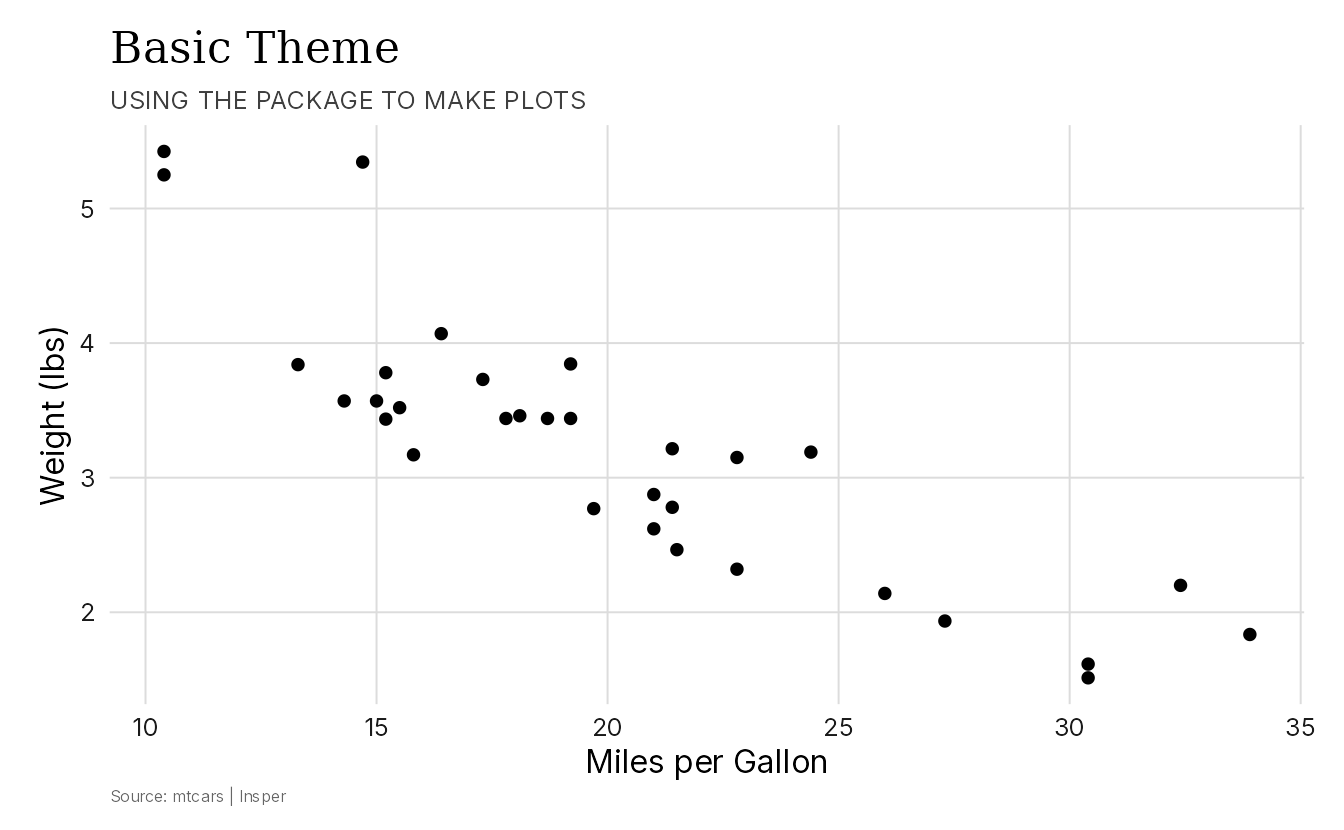
Users who have GT Ultra, Acumin, or Verdana installed can use them by
setting font_title and font_text in
theme_insper().
base_plot +
  theme_insper(font_title = "GT Ultra", font_text = "Verdana")
Where Acumin is installed, it can carry subtitles and highlights. The chunks below are not run, because they name fonts that the package does not bundle.
base_plot +
  theme_insper(
    font_title = "Georgia",
    font_text = "Inter"
  ) +
  theme_sub_plot(
    subtitle = element_text(family = "Acumin Pro ExtraCondensed", size = 14)
  )
Verdana is the brand’s fallback for Inter. Since Inter ships with the package, you rarely need it.
base_plot +
  theme_insper(
    font_title = "Georgia",
    font_text = "Verdana"
  )
Colors
Insper’s brand guidelines target printed materials, not charts. The kit specifies Pantone references and a handful of tints and shades per hue family, but no categorical sequence. The bundled palettes will not suit every chart, so it helps to know how each one was built.
Where each palette comes from
Some palettes are the brand kit verbatim.
-
mainis the six secondary hue bases plus vermelho, interleaved so that adjacent categories contrast. - The six hue sequentials (
turquesa,verde,amarelo,laranja,rosa,roxo) are the kit’s own five tokens per family, sorted light to dark by perceptual lightness. No color was invented. -
cinzais the five neutral grays.
Others are derived, because the kit does not ship what a chart needs.
-
mutedismaindesaturated by 25%. None of its seven hexes appear in the guide. It exists because full-chroma brand hues are overwhelming across large filled areas. -
vermelhoandazulare interpolated ramps. The kit ships only a single base token for each, so the other steps were interpolated in CIELAB. Only the base token is official: it sits at the middle ofvermelhoand at the dark end ofazul. - The four diverging palettes have brand colors at both arms but share
a neutral midpoint,
#F4F4F2, which is not a brand token.
Finally, colorblind is the Okabe-Ito palette, which
contains no Insper colors.
Building a categorical set by hand
When main is too loud and muted is not
distinct enough, you can pull mid-range steps out of the sequential
ramps. Those steps are still brand colors, and finding a set that works
is mostly trial and error.
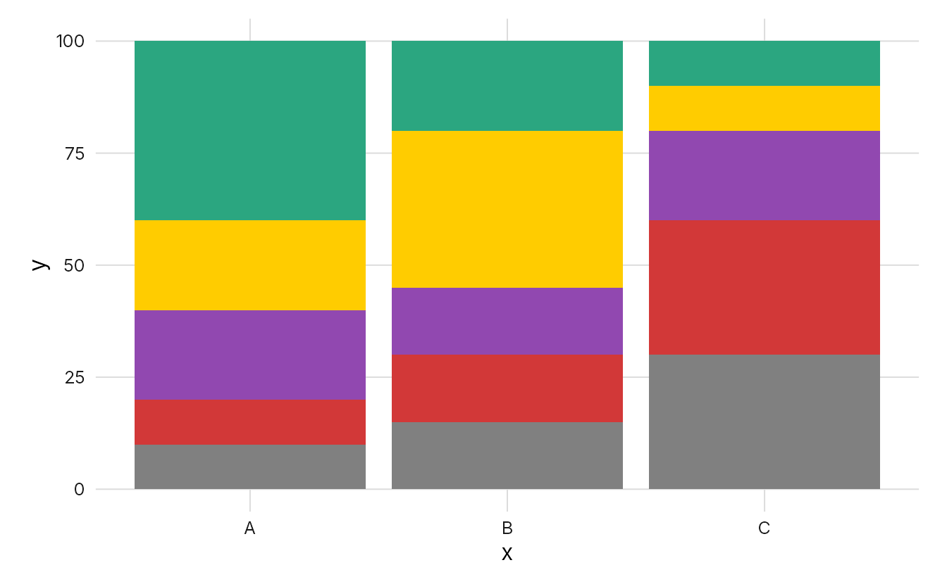
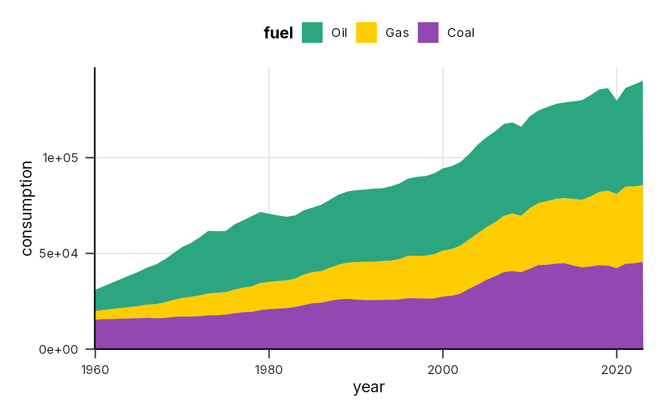
paleta <- c(
  insper_palette("turquesa")[4],
  insper_palette("amarelo")[3],
  insper_palette("roxo")[2],
  insper_palette("muted")[1],
  insper_palette("cinza")[3],
  insper_palette("verde")[3],
  insper_palette("laranja")[3]
)
The indices were chosen by eye: darker steps for the light families (turquesa, amarelo, verde, laranja) and a lighter step for roxo, which is very dark at its base. The result is shown below on a stacked bar chart and a stacked area chart.
Insper Cidades
The Centro de Estudos das Cidades (Laboratório Arq.Futuro) publishes its own application manual. It adds four colors to the shared institutional vermelho, branco and preto.
insper_palette("cidades")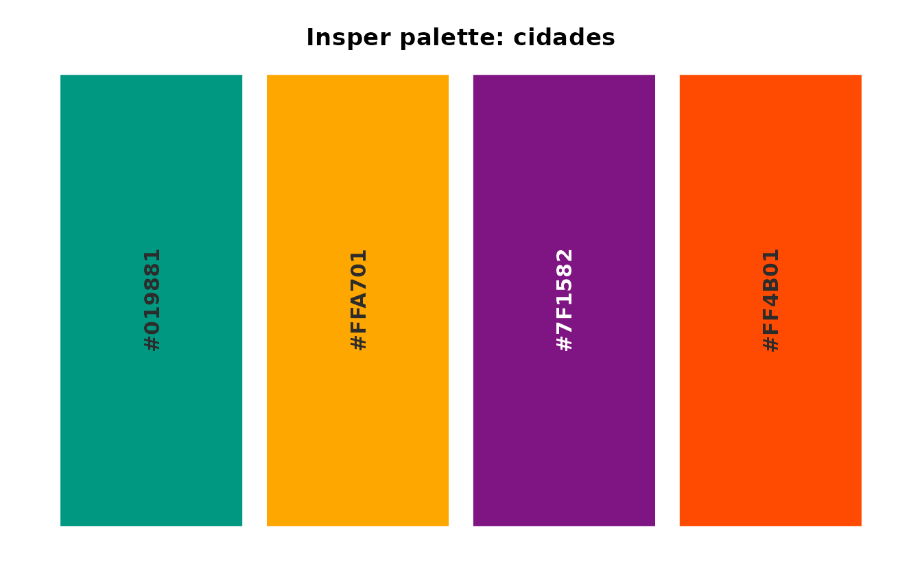
These are folhagem, solar,
asfalto and tijolo. Everything prefixed
cidades in insperplot comes from that manual
rather than the institutional brand kit, and nothing in the package
defaults to them.
The sequential ramps are derived
Unlike the six institutional hue families, the Cidades manual ships no tints or shades, only the four base colors. The package therefore builds each ramp: seven steps interpolated in CIELAB from a lightened anchor, through the official color, to a darkened one. The official color is pinned at position 4.
insper_palette("cidades_folhagem")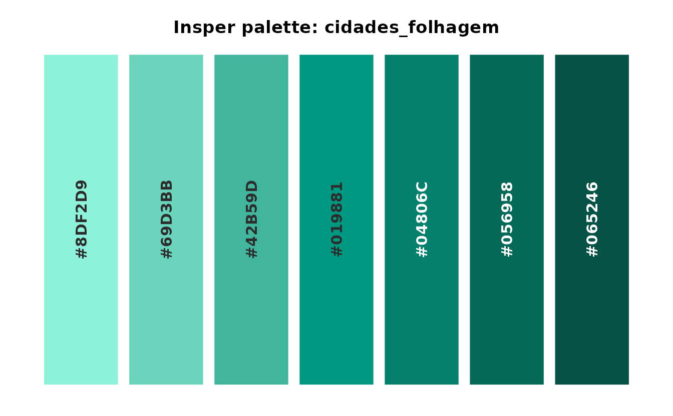
Without the pin, rounding in the interpolation would shift the
official color slightly: folhagem would come back from its
own ramp as #009880 rather than #019881.
Text contrast
The Cidades manual has no accessibility page, so unlike the institutional colors there is no official ruling on what text color to put on these backgrounds. The values below are computed from WCAG relative luminance rather than taken from a guide.
| Color | Contrast vs white | Contrast vs black | Use |
|---|---|---|---|
folhagem |
3.61 | 5.81 | black text |
solar |
1.95 | 10.78 | black text |
asfalto |
9.01 | 2.33 | white text |
tijolo |
3.36 | 6.26 | black text |
Asfalto is the only one of the four that takes white text.
Diverging data
There are two Cidades diverging palettes.
insper_palette("cidades_folhagem_asfalto")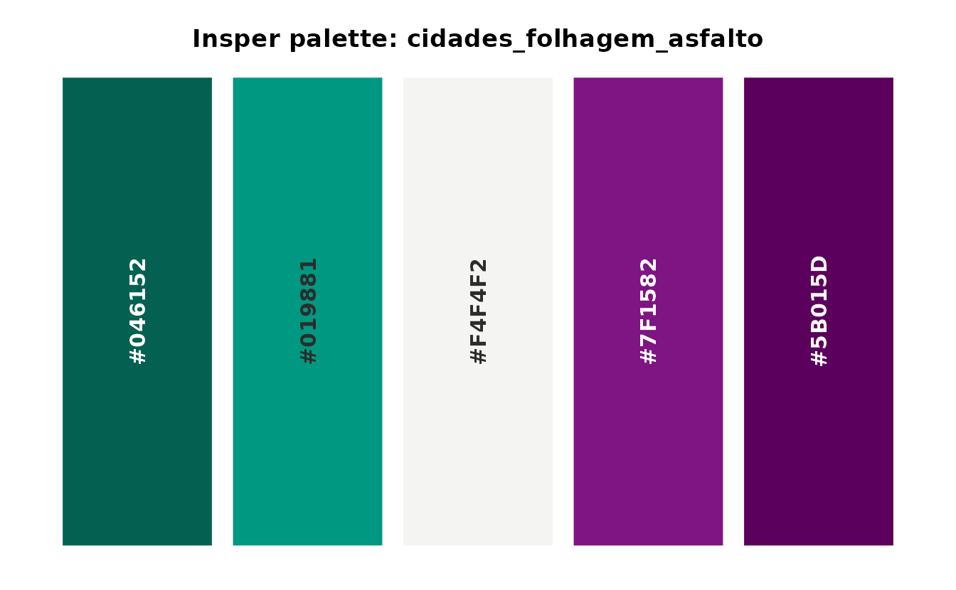
insper_palette("cidades_folhagem_tijolo")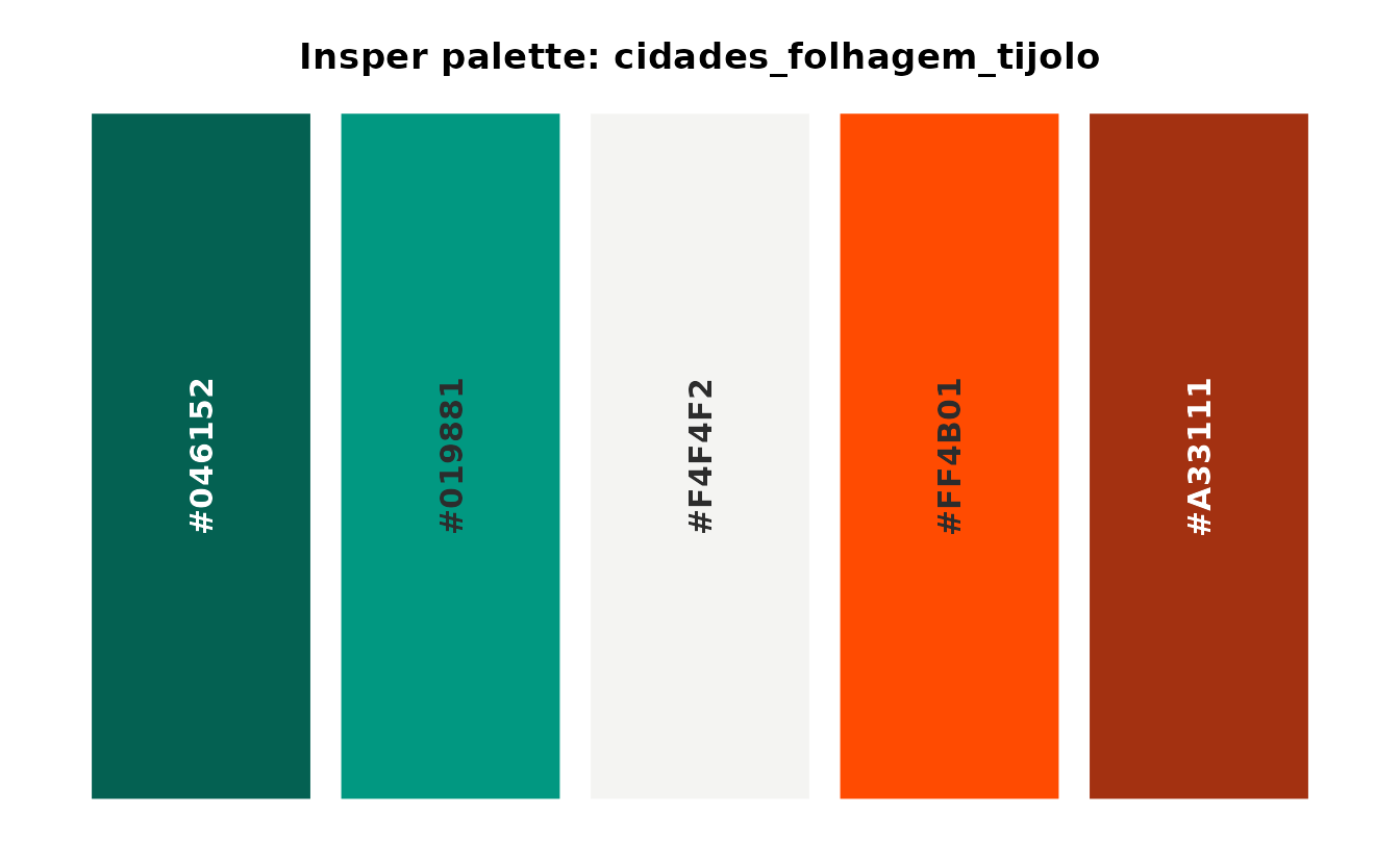
Both share the same neutral midpoint (#F4F4F2) as the
institutional diverging palettes, so they drop into
scale_fill_insper_c() the same way.