This vignette walks through the three parts of insperplot: the theme, the color scales, and the convenience plot functions.
Installation
Install the latest release from the Insper Cidades r-universe, which ships pre-built binaries for Windows, macOS, and Linux.
install.packages(
  "insperplot",
  repos = c(
    "https://inspercidades.r-universe.dev",
    "https://cloud.r-project.org"
  )
)
The development version installs from GitHub.
remotes::install_github("inspercidades/insperplot")The examples below load ggplot2 and dplyr alongside insperplot.
Basic Usage: theme_insper()
theme_insper() applies Insper’s typography and colors to
a ggplot2 plot. Add it as a layer like any other theme.
ggplot(mtcars, aes(mpg, wt)) +
  geom_point() +
  labs(
    title = "Basic Theme",
    subtitle = "Using theme_insper()",
    caption = "Source: mtcars"
  ) +
  theme_insper()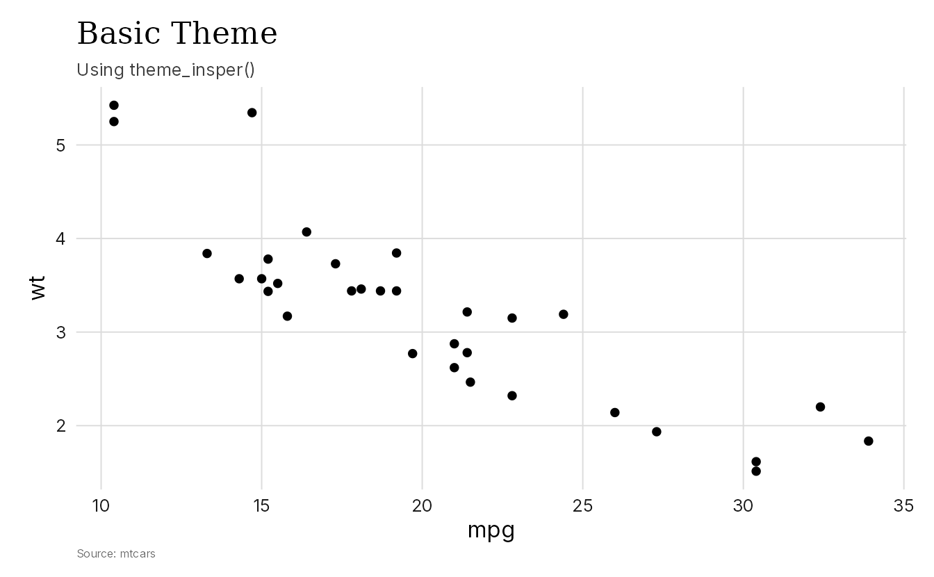
Customizing the Theme
theme_insper() takes a few arguments for common
changes.
-
font_title: Font for titles. Default is"Georgia". -
font_text: Font for body text. Default is"Inter". -
grid: Grid lines. Default isTRUE. -
border: Border style. Options are"none"(default),"half", or"closed". -
align: Title, subtitle, and caption alignment. Default is"panel".
The following examples use macro_series, a dataset
bundled with insperplot. It contains monthly Brazilian macroeconomic
indicators from the Brazilian Central Bank, including inflation (IPCA),
industrial production (IPI), and economic activity (IBC-Br). See
?macro_series for details.
Here we plot the IBC-Br index (a monthly GDP proxy) with a
"half" border and a sans-serif title font.
ggplot(macro_series, aes(date, ibcbr_dessaz)) +
  geom_line(lwd = 0.7) +
  labs(
    title = "Economic Activity Index",
    subtitle = "IBC-Br, seasonally adjusted (base 2002 = 100)",
    x = NULL,
    y = "IBC-Br",
    caption = "Source: Banco Central do Brasil"
  ) +
  theme_insper(font_title = "Inter", border = "half")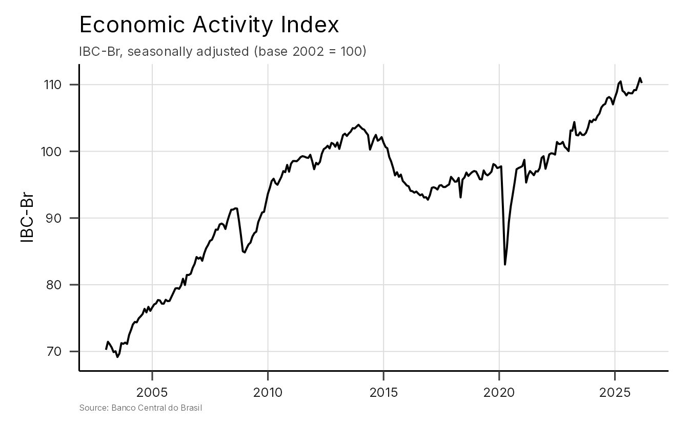
Fine-Tuning with theme_sub_*()
For more granular control, ggplot2 4.0+ provides
theme_sub_*() helper functions that target specific theme
components. Add them after theme_insper() to override
individual elements without resetting the whole theme.
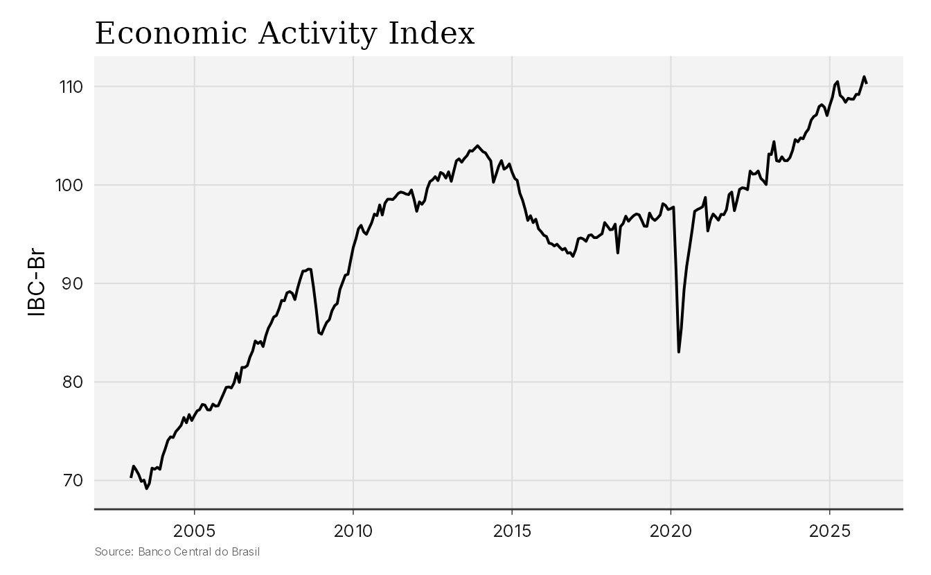
In the example below, we add axis ticks and lines to the x-axis with
theme_sub_axis_x(), and change the panel background with
theme_sub_panel().
ggplot(macro_series, aes(date, ibcbr_dessaz)) +
  geom_line(lwd = 0.7) +
  labs(
    title = "Economic Activity Index",
    x = NULL,
    y = "IBC-Br",
    caption = "Source: Banco Central do Brasil"
  ) +
  theme_insper() +
  theme_sub_axis_x(
    ticks = element_line(color = "gray20", linewidth = 0.25),
    line = element_line(color = "gray20", linewidth = 0.5)
  ) +
  theme_sub_panel(
    background = element_rect(fill = "#f3f3f3", color = NA)
  )
Working with Colors
Use insper_palette() to preview a specific palette and
show_insper_palettes() to see all available palettes at a
glance.
insper_palette("vermelho")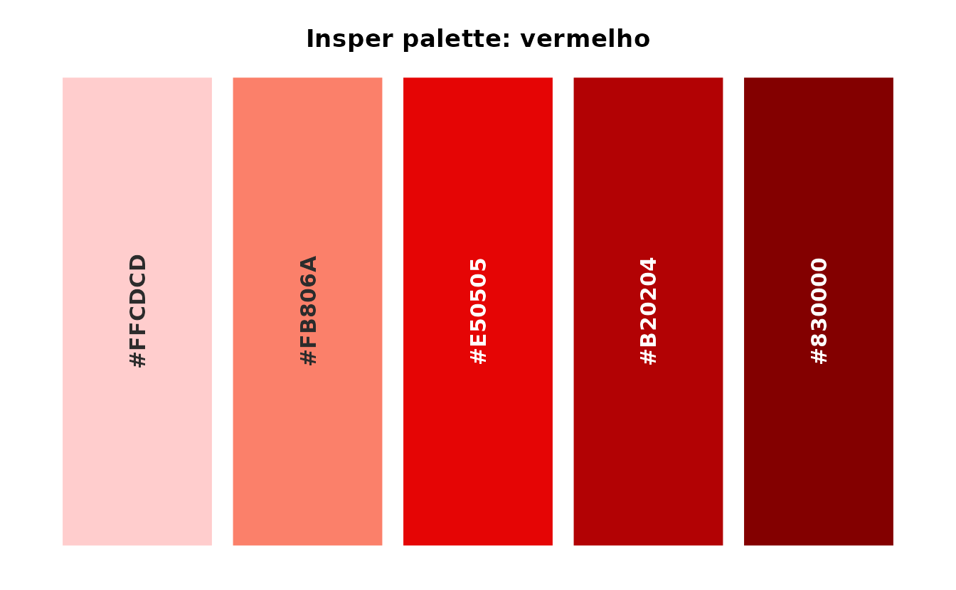
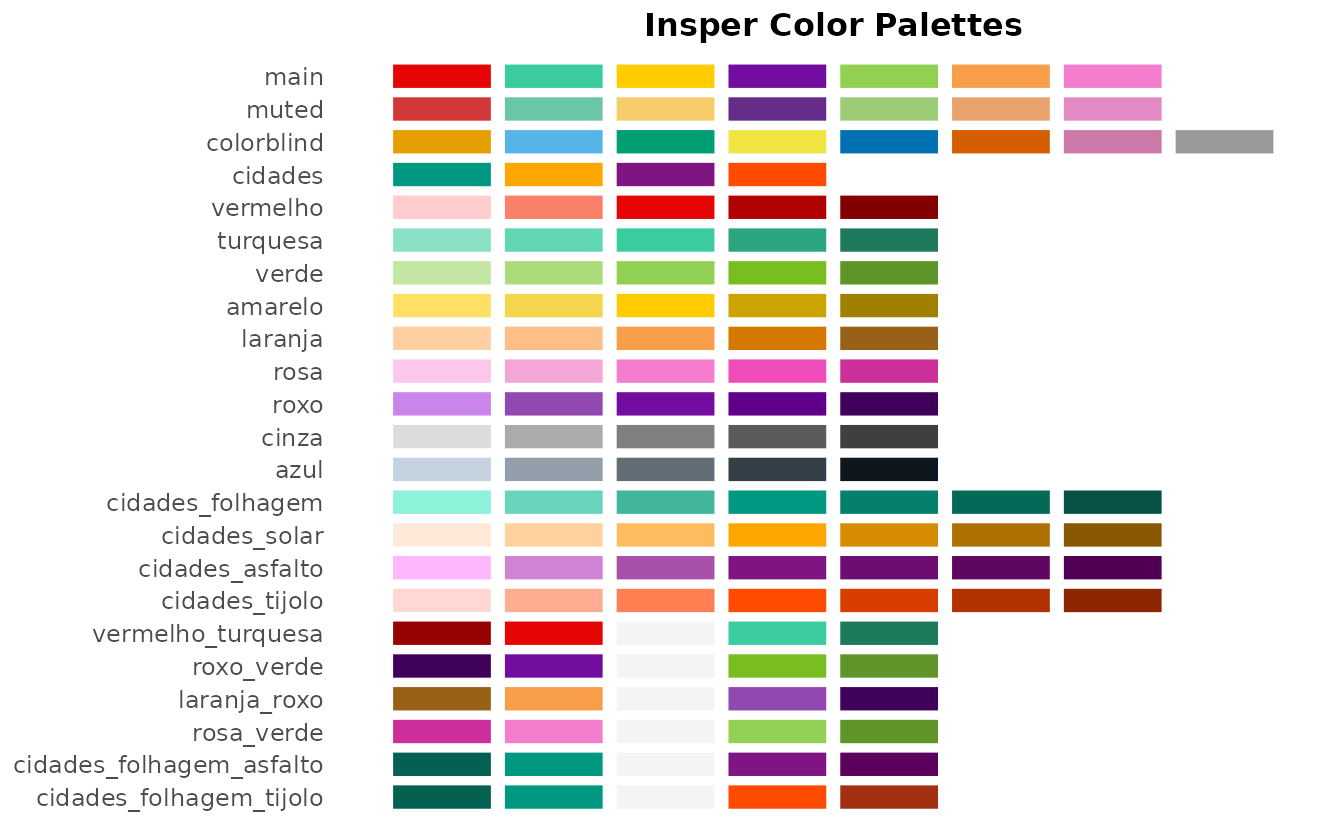
Palettes come in three types: qualitative for categorical data, sequential for ordered magnitudes, and diverging for data with a meaningful center. They also come in three families.
-
Institutional (
main,muted, and the single-hue ramps likevermelhoandturquesa) is built from Insper’s 2026 brand kit and is what every function defaults to. -
Insper Cidades (everything prefixed
cidades) belongs to the Centro de Estudos das Cidades sub-brand. Use it for that center’s work, and don’t mix it with the institutional palettes in one chart. The two families are close enough in color that a chart using both looks like a rendering error. -
colorblindis the Okabe-Ito palette. It contains no Insper colors and serves as an accessibility fallback for when some readers can’t tell the brand hues apart.
show_insper_palettes() also returns a data frame of
palette metadata invisibly, including a recommended_use
column, and accepts a type filter.
show_insper_palettes("diverging")

meta <- show_insper_palettes()
subset(meta, type == "qualitative")
The design guide vignette,
vignette("brand-kit", package = "insperplot"), covers
palette provenance and accessibility in more depth.
Using Colors in ggplot2
The scale_color_insper_*() and
scale_fill_insper_*() functions bring Insper colors into
ggplot2 plots. Use the _d variants for discrete
(categorical) data and _c for continuous (numeric)
data.
Discrete Scales
For categorical variables, use scale_color_insper_d() or
scale_fill_insper_d().
The examples below use fossil_fuel, a dataset bundled
with insperplot. It tracks global primary energy consumption (in TWh) by
fuel type (coal, oil, and gas) from 1800 to 2023, sourced from Our
World in Data. See ?fossil_fuel for details.
First, a stacked area chart of consumption since 1960 using
scale_fill_insper_d().
recent_fuel <- subset(fossil_fuel, year >= 1960)

ggplot(recent_fuel, aes(year, consumption, fill = fuel)) +
  geom_area() +
  scale_fill_insper_d(palette = "main") +
  scale_x_continuous(expand = expansion(mult = c(0))) +
  scale_y_continuous(expand = expansion(mult = c(0, 0.05))) +
  theme_insper(border = "half")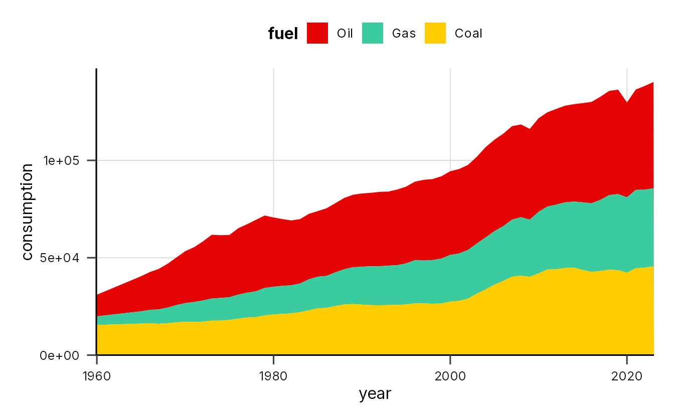
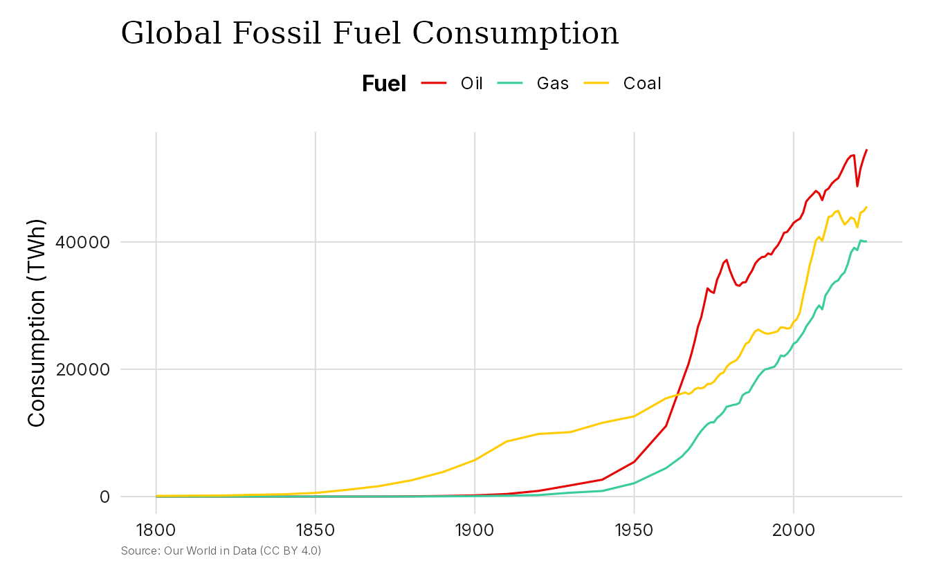
The same data shown as a line chart with
scale_color_insper_d().
ggplot(fossil_fuel, aes(year, consumption, color = fuel)) +
  geom_line() +
  scale_color_insper_d(palette = "main") +
  theme_insper() +
  labs(
    title = "Global Fossil Fuel Consumption",
    x = NULL,
    y = "Consumption (TWh)",
    color = "Fuel",
    caption = "Source: Our World in Data (CC BY 4.0)"
  )
Continuous Scales
For numeric variables, use scale_color_insper_c() or
scale_fill_insper_c(). These build a color gradient from
any Insper palette.
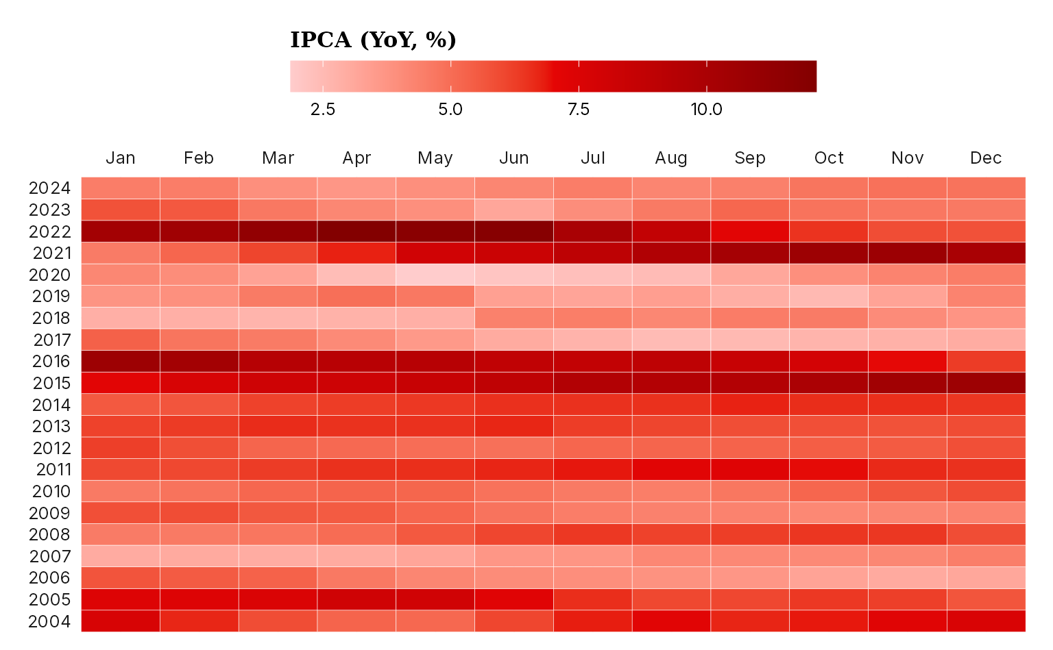
The heatmap below shows 12-month rolling inflation (IPCA) across
years and months using the "vermelho" palette. We compute
the rolling product from the macro_series dataset using
lubridate (for date parts) and RcppRoll (for
the rolling window).
macro_calendar <- macro_series |>
  mutate(
    year = lubridate::year(date),
    month = lubridate::month(date),
    ipca12m = RcppRoll::roll_prodr(1 + ipca / 100, n = 12) - 1,
    ipca12m = ipca12m * 100
  ) |>
  filter(between(year, 2004, 2024))

ggplot(macro_calendar, aes(month, year, fill = ipca12m)) +
  geom_tile(color = "white", lwd = 0.1) +
  scale_x_continuous(
    breaks = 1:12,
    labels = month.abb,
    position = "top",
    expand = expansion(c(0))
  ) +
  scale_y_continuous(breaks = 2004:2024, expand = expansion(c(0))) +
  scale_fill_insper_c(
    name = "IPCA (YoY, %)",
    palette = "vermelho"
  ) +
  labs(x = NULL, y = NULL) +
  theme_insper() +
  theme_sub_legend(
    title = element_text(family = "Georgia", size = 12),
    title.position = "top",
    key.width = unit(4, "lines"),
    position = "top"
  )
Convenience Plot Functions
insperplot also provides plotting functions that combine a geom, a
scale, and the theme in a single call. Each function returns a standard
ggplot object, so you can still add layers, labels, or other
customization with +.
Time Series
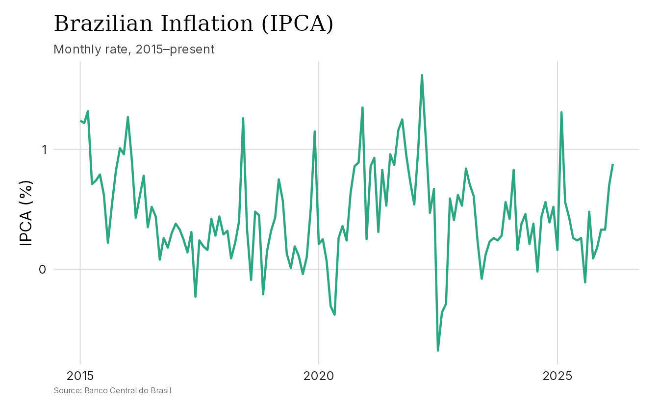
insper_timeseries() creates line plots of time series.
It handles Date and POSIXct axes automatically
and supports multiple series via the color argument.
recent_macro <- subset(macro_series, date >= as.Date("2015-01-01"))

insper_timeseries(recent_macro, x = date, y = ipca) +
  labs(
    title = "Brazilian Inflation (IPCA)",
    subtitle = "Monthly rate, 2015–present",
    x = NULL,
    y = "IPCA (%)",
    caption = "Source: Banco Central do Brasil"
  )
Saving Plots
To save a plot with the right fonts, use ggsave() with
the ragg device.
p <- ggplot(mtcars, aes(wt, mpg)) +
  geom_point() +
  theme_insper()

ggsave(
  "my_plot.png",
  p,
  width = 8,
  height = 5,
  dpi = 300,
  device = ragg::agg_png
)
Alternatively, save_insper_plot() wraps
ggsave() with defaults for Insper-branded output. It
measures dimensions in centimeters, uses a golden-ratio aspect ratio,
and picks the ragg device for PNG files when ragg is installed.
save_insper_plot(p, "my_plot.png")

# Custom dimensions (in cm by default)
save_insper_plot(p, "my_plot.png", width = 16, height = 10)
Available Functions
In addition to insper_timeseries() shown above,
insperplot includes convenience functions for other common chart
types.
| Function | Chart type |
|---|---|
insper_timeseries() |
Line plots for temporal data |
insper_barplot() |
Vertical and horizontal bar charts |
insper_scatterplot() |
Scatter plots |
insper_area() |
Area charts |
insper_boxplot() |
Box plots |
insper_violin() |
Violin plots |
insper_histogram() |
Histograms |
insper_density() |
Density plots |
insper_heatmap() |
Heatmaps |
All functions return ggplot objects, apply
theme_insper() by default, and accept a
palette argument for Insper color palettes. See their help
pages, such as ?insper_barplot, for details.
Learn More
- The package website has the full function reference and more articles.
- The GitHub repository has the source code and issue tracker.
- Insper brand colors documents the color system behind the package.